Friday 28 September 2012

Vector Wallpapers


Here is my simple pattern wallpaper I made in Illustrator. It is fairly straight forward and requires the align tool to keep all the shapes in the right column and row. This wallpaper is the most in touch with the logo and the album theme, but I find the others more interesting to look at. 

 
This is a simple, elegant design made on Photoshop. Using the 'Edwardian Script', I created this pattern by coping my 'S' type, rotating it and aligning it altogether with a quick gradient.

 
Despite how complicated this beautiful design looks, it is very quick and easy to make. Create a gradient and change its blending mode to a jittering effect. Go over the top with colourful gradient, then paint over this with scattered brush. This design reminds me of downward flames, which I could use in my final CD package and link to rocketship fire, the theme of the album.

 
This is my own version of the bokeh effect, made by a circular brush painted over several layers on top of a rainbow gradient. It is simple and looks beautiful.

 
I tried to link each image to my album theme as much as possible. Although for this example I did use texture packs found on manang's free texture libary I should in future use my own textures to avoid copyright. I chose images of the sky to symbolise Space and metal and spanners for the idea of a spaceship. I blended these layers together and added my own logo with an embossed look. 

 
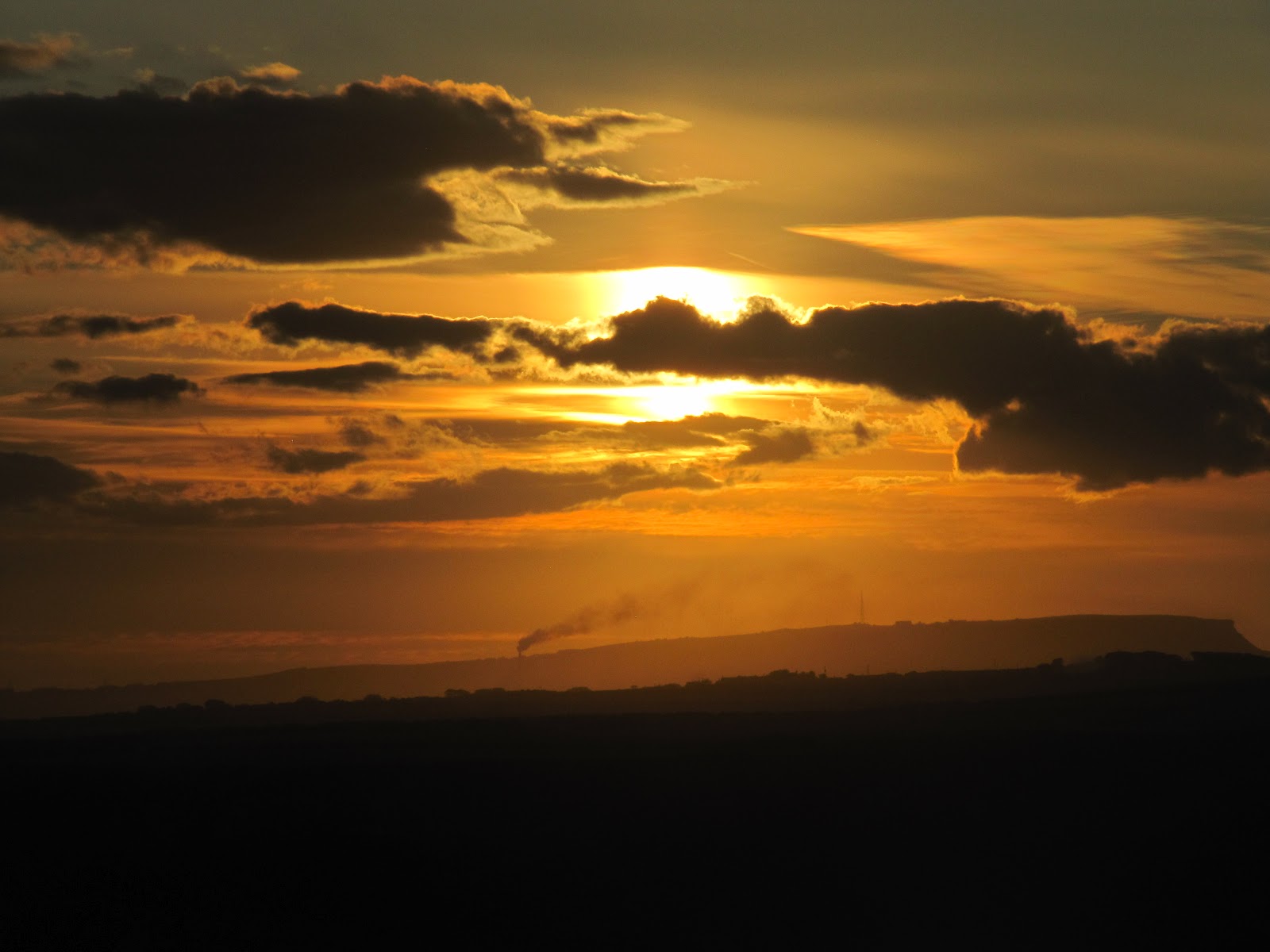
This time I used images that my father took and then I added this grunge effect. These pictures of the coast at Stoer in Scotland, the full-moon rise behind the mountain range of Suilven in Scotland and the sunset at Whitby in Yorkshire, England. This effect gives a cool, grimey look to image, which gives an intense and dark mood, though this effect may not work as they are all lovely places! I chose these three images as they all contain the sky and one containing the moon, which has wonderful connotations to Space, the theme of the album.


Thursday 27 September 2012

Final Logo design


This will be my final logo design. It is an edited version of the previous 3D logo design I made, using elements of my vector design and a nod to the my stitching idea. I may want to tweak the size and maybe create the stitch effect using hand-made materials, however I am pleased with the overall design.

Photo-shoot for CD art

After looking at examples of CD packaging and art, we had to come up with our own unique idea for album art. Walking around the college, we picked up a few instruments, artwork, and landscape to link to our singers and bands.


When I took the photos, I was focused on recording equipment such as microphones as StarKid is known for going on tour and uses such devices.  I also took photos of some of the instruments me and my brother own, like the stools, guitars and amps which are linked to the instruments the musicians of StarKid use. I also tried to focus on Space-age imagery, like the tin-foil robot and the shiny sliding doors that remind me of the starship in StarKid's musical, 'Starship'. Finally, I waited until night to take pictures of the sky to symbolise Space. Unfortunately, I couldn't see any other appropriate imagery like the moon or the stars, but the clouds created a wonderful atmosphere.


The are extra images I found, taken by both me and my father. I took the photos of the sunset near our home and my fathers telescope, which I link to my album theme as it is to do with star gazing.
My dad took the rest: sunsets at Whitstable and Whitby, the moon rise behind Suilven, the coast at Stoer, the rainbow in East Barnby, the moon by the coast at Whitby and the sunset in Nefyn.


Tuesday 25 September 2012

Developing a computer generated logo part 2


To make the iTunes logo I drew reference from the real logo to get the size and colours right. The iTunes logo you see is the one I created. After this, I just copied it, changed the colours and logo image to a rocketship to make my own StarKid Logo. 


Following these tutorials as best as I could, I created this 3D shield and emblem design on Illustrator. Though this works well, the lighting on the different gradients doesn't look very consistent, however I am pleased with the glossy look of the shield.


Sunday 23 September 2012

Bookbinding experiments


1) Stitching as a form of binding. It works well as it keeps each page securely together, however it is harder to keep the binding neat.


2) Stapling, which is quick easy and simple, however easy to break. 


3) Rubber binding, which is easy, however one is not enough to keep it secure and it falls apart easily- though this is fixable.


4) Star folding. This is my favourite as it has had more effort put into it since it is the most complex and it held together well with glue. This piece goes with one of themes as it supposed to be a star. I have also used different sorts of paper to make look decorative.


5) Using plasters, I made and adhesive binding for this book. The tutorial I was following said to use masking tape, but I used masking tape as it was the next best thing. Unfortunately, this way made it harder to keep the pages aligned.