
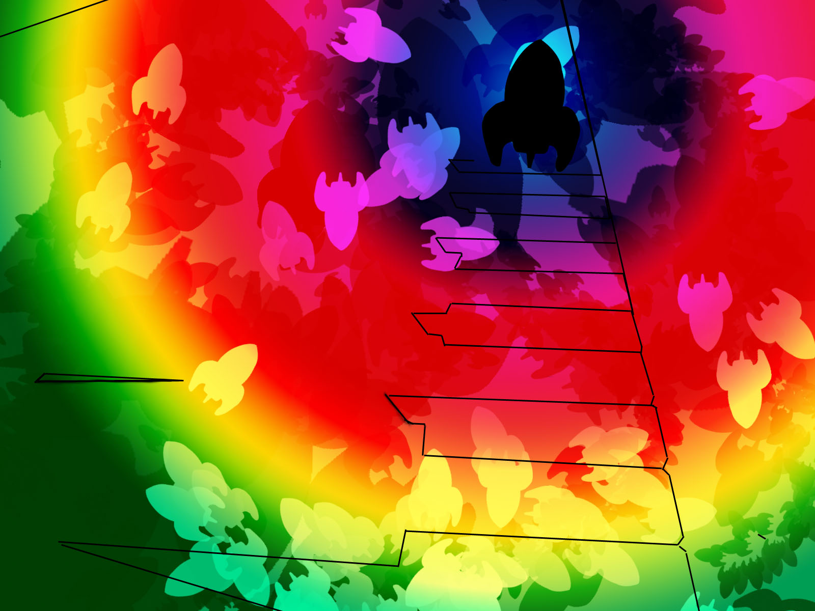
After working on the wallpaper and edited designs, I decided on using a few of these various styles to create a look for my packaging and artwork, trying to give these two a harmonious look. Through the wallpaper tutorials, I've decided that I like the look of the grunge wallpaper the best, as the blackened style contrasts to the rainbow colours nicely adding a space-like atmosphere. Though most of these images are mostly Photo shop created, I've still been look for ways to incorporate my handmade work, my photos and my Photo shop wallpapers.

Abstract brush experiment

Aurora wallpaper effect

Edited photo of keyboard

Grunge edition of Bokeh effect

Grunge abstract experiment


Created Smoke

Smoke made by brush tools

StarKid text design with aurora background clipping mask

Glowing rainbow design

As link StarKid to being humorous and light but with dark sides as well, I'd like to do some cartoons for the booklet as well. StarKid has always had a cartoon feel to their plays, especially in their musical: 'Holy Musical B@man!'