Characteristics of Lino: Smooth, durable, bendy, tough, hard, flat, reinforced, carve-able.
Potentials: Carve it, print with it, emboss, rubbing, reduction printing, tough/ sturdy, print onto multiple different surfaces, easy for simple designs or big sized pieces
Limitations: Mistakes are irreversible, not 3D, you have to work hard to get texture, hard to cut, limited, colour application, rollers etc, hard to clean, need to wear barrier cream, hard to get off, need to use white spirit to get off and it is fuming, takes a long time to dry, time consuming to cut, difficult to get into.
Wednesday, 28 March 2012
Friday, 23 March 2012
Lino experiment

On tracing paper, I drew my design for the cutting of the Lino. The blank in the hand represents the cut areas and the shaded areas represent the smooth surface of the Lino. I had not made any plans at this stages on how to decorate the background.

After deciding on my design for my final outcome, I came up with a hand design as I am basing my outcome on touch. A hand held up with the words "hold me" and "never let me go", which I am also going to use in my typography outcome.

My first print was using yellow ink on white paper. After this initial experiment, I decided to use a different colour for the ink as I disliked the colour. I wanted to use the blue ink, however it was already being used. Some of the design is covered up with ink, so to improve the design I would have to cut bigger ditches in the Lino so the ink won't reach.

Here I used green ink on blue paper as I realised the blue ink I wanted to use wouldn't be visible on the blue paper I was using and blue was the only colour I could find. I prefer this print to the other one as the ink and the paper are more separate from each other. The text on the left hand side is more visible as the ink from the previous try lingered on it.
Monday, 19 March 2012
Sydney Opera House by Staples: an in-depth analysis
This was made by the people of the retail and stationary company Staples in Australia, for an installation to show the skill of the students who made it. In the video, they show in time-lapse how they made the iconic structure of Sydney and the spectacular opera house. What drew my attention to this video is that they use products you would be able to buy in Staples, which highlights their properties and also advertises the store, which could be one reason why they made it. Not only that, but they also use paper, card and post-it notes for some of the structures, which is the material I am interested in using in making my final outcome. They use things like pencil, pens, paper, card and bull clips for the building structures and they paint objects like the Opera House with Tipp-ex. They use simple ways to hold the materials together, such as pins and elastic bands, The result being more colourful than just using glue (which they do use, in moderation). They make sure that the piece is neat, nothing out of place. It reminds me of the card made buildings Zim & Zou made for their installation. I love this piece as you can see the effort gone into it. It is very extensive: showing even the water and the sky around the harbor. I am very interested in structures and shapes and this has helped inspire me for my typography ideas. I am interested in the senses of touch and light. My idea is to make an animated gif for my outcome which was also inspired by this video. I love the bright colours used on the products, as they also thought about colour carefully, to express the beauty of the harbor.


Friday, 16 March 2012
My Exam Brief
THE TYPOGRAPHY BRIEF
- Why have you selected this brief?
I enjoyed the beginning of the year starter project about typography and I wanted to expand my knowledge of typography. I wanted to create something different at the better standard than my previous Typography outcome.
- What are you planning to look at for primary/secondary research?
- Which artists/designers will you be looking at (you must select a minimum of 3 from the brief)
- What materials/techniques would you like to experiment with?
- Which outcome(s) are you planning to make?
Rob Ryan work: in-depth analysis

"WE HAD EVERYTHING"
This is 'We had everything' by Rob Ryan, a graphic designer, who makes thin and delicate paper cut outs with pictorial images and his own typographical font style. He make his work for exhibitions and his design books. He usually makes images depicting love images with a fantasy feel, like this piece, with nature surrounding the two lover figures, which shows that all the two people need is each other. The nature surrounding them shows the beauty of their relationship, and the red paper used for the cut out displays passion. I like this piece as their is a lot to take in on piece, but it also displays a sense of mayhem around the figures. The piece could be suggesting through past tense is that the lovers had everything, but there was two much chaos and confusion around them, which makes me sad. I prefer Rob Ryan's other piece 'This is for You', where a man figure is showing a bold declaration of love. Like 'This is for You', Rob Ryan has gone into amazing detain and painstakingly cut it out, even trying to go into symmetry, to show to couple had near perfection and a lot of work had gone on to make their relationship work and beautiful.
Wednesday, 14 March 2012


Paper relief, rubbing and embossing

Loud! Relief
Although the work is hard to see, I did make the relief on the paper by firmly gluing it on. I decided on my word 'Loud!', as it relates to my sensual typography.

Loud! Graphite
Using my relief, I rubbed graphite on a separate sheet of paper. This is my favourite rubbing, as it is clear to read and neater than the others.

Loud! Oil Pastels
I tried to use different colours to show a wider use of techniques. The best way to do that was to use oil pastels. I also wanted to experiment with coloured paper, however I ran out of time.

Loud! Charcoal
This is the boldest and the effective rubbing, however, the rubbing comes out a little unclear. To be clearer I needed deeper relief.

Loud! Emboss and Watercolour wash
This came out a little wrong as the emboss wasn't very deep and it is the wrong way around, however I did it that way so it would be clearer. The relief needs to be deeper.
Senses explored through different mediums

Using oil pastels, collage from newspapers, line drawing using fineliner, letters made out of ties and letroset.
Tuesday, 13 March 2012


Wednesday, 7 March 2012
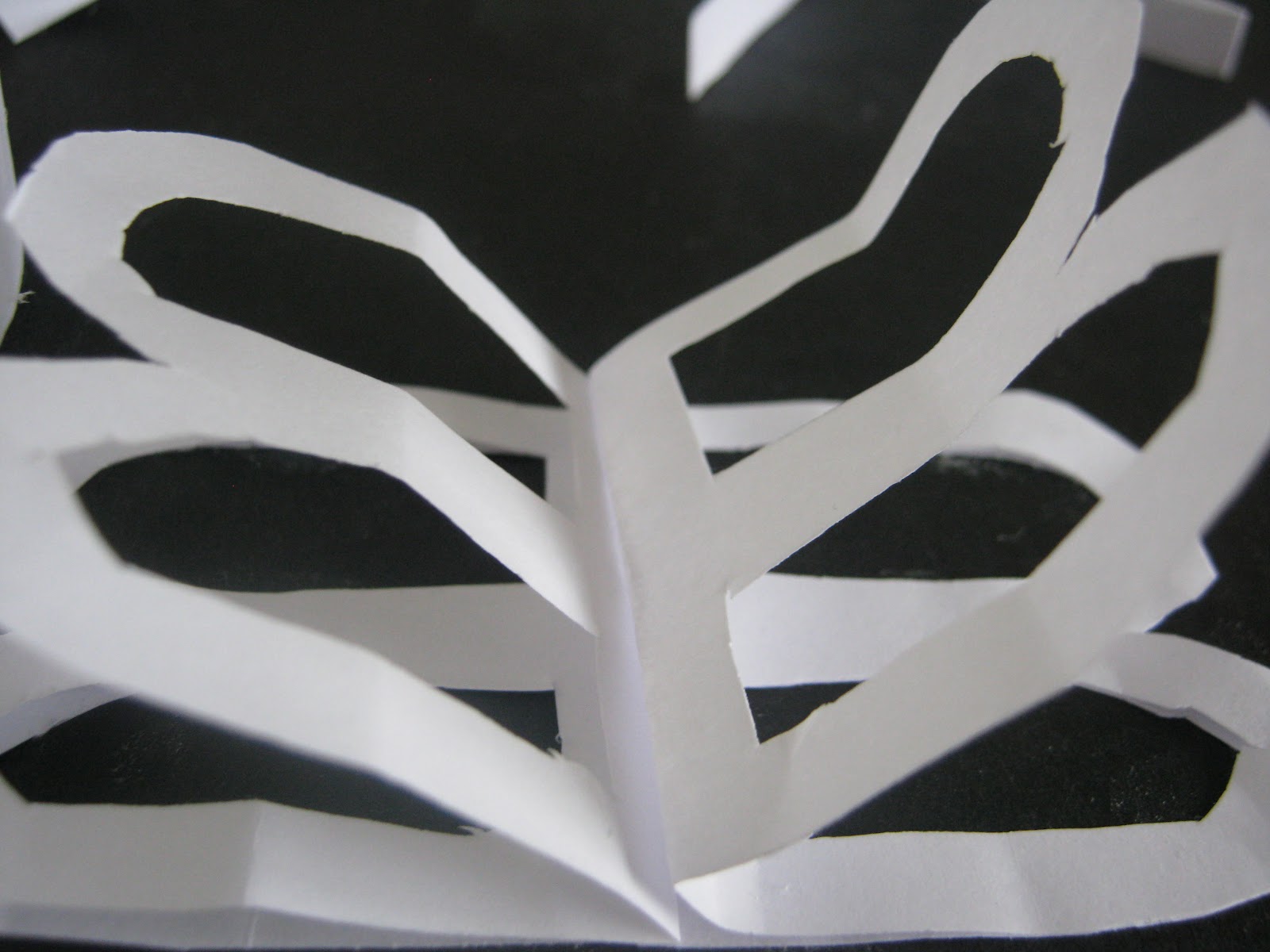
Typography paper installation


I made only two things for the typography paper installation as I was away for most of it. However, I made the RIP and CUT pieces by ripping, cutting and tearing paper. I was praised for RIP as it was an innovated way to present our type ideas. I used several techniques such as folding and scrunching the paper to made it look 3D, as I was interested in making my outcome out of paper to make it 3D.

Subscribe to:
Posts (Atom)