Shawnimals is family toy company based in Chicago and founded by Shawn Smith and his wife Jen Brody. Not only do they make toys, but they have produced their own game apps for the iPhone and iPad, based on the fantasy world created for their toys, called Ninjatown. Each toy has its own character description and lives in a certain part of the land created for these characters. Their designs are usually cartoon-like, cute and humorous for a young target audience. They make plush toys, key-chain toys and vector cartoon shapes as character stickers.
Here are some of the ranges in toys and collectables on the 'Shawnimals' website:
From their Ninjatown collection, this is Animal Spirit Ninja
Like many in the Ninjatown collection, this toy, Animal Spirit Ninja, follows a simple design with the only stand-out feature being the large eyes popping out behind furry bat-like hood. The effect of this and it's stumpy well rounded limbs is that the toy is made to look impossibly cute! The fur and cute design would appeal to children of both genders as it has a warm brown masculine colour but cute appeal. This is my favourite toy on their website, maybe my favourite toy ever since it just struck a cord with me. It's brown hood and animalistic body suggests it is a mysterious benevolent creature which comes from a dark forest, since it is warm and inviting brown, quite rustic and practical in design.
'Mustachios' Collection
Appealing to child-like humour and simple cartoon style, mustachios would appeal to children but also a indie hipster teenager, as most seem to have an affiliation which ridiculous or retro mustaches, steaming from the need to be nerdy or different from others.
Other collectables and art:
'Pocket Pork Dumplings' Collection
Ninjatown charms
Ninjatown stickers
'Mr Demon' one of the characters of the fantasy world
The Shawnimals company could really inspired me in my outcome as they believe size and complexity is not important: the more simple it is, the more it stands out. Also,the character of the toy really matters, even if they are part of the same collection and has a similar or signature appearance, each toy is unique and has it's own story, and that is what inspires me the most.
1+2) These are two toys my Grandmother made by a simple knitting patterns and tights, recycled as filling. Felt has been stuck on for the eyes.
3) Toys I made from recycled pencil cases and stuffed with cotton wool. The letters on the blue one's chest spells 'Robin' (for my brother) and has been stitched into the fur.
4) Plastic Toys that has been crafted to look like letters. I thought it was interesting to mix typography with Toys, so I took this picture outside a toy shop in Kingston.
Artwork from featured artists I have looked at before, artists I have just found and art from the previous project that will be featured in my outcome.
Marydoodles is the created name of an artist from Minnesota, USA named Mary. She is known mostly as an illustrator, working with paint, ink and pencils, however she is usually part of the production team behind the 'Epic Rap Battles of History' music videos, a popular web series on YouTube- were she is seen making most of the props and costumes. After the video is posted, she usually paints a visual representation of the music video and uploads it to her YouTube channel: http://www.youtube.com/marydoodles where she shows the making of the painting in time lapse. She herself puts the original painting up for auction and sells other copies, making her art her living.
Her art varies in techniques and materials: ink, water colours, coffee and even showing the controlling of water is shown to have an impact in the design. Because of this wide array of illustrative tools, she uses a lot of colour in imaginative and clever ways which impacts on the mood on the piece. A great deal of work tells a story, which is shown in her creation style of time-lapse. Examples of these works are 'Space Zombie', 'Time Bomb' and 'It's a Sloth eating a donut'. These stories can fold seamlessly into each other or they become a sort of cartoon strip being created as she paints.
'Time Bomb', is one of Mary's most unique paintings, not because of it's quick methods of painting and style but because of it's seamless transitions and editing as she paints, which makes it look like nothing has changed at all. She has also chosen to play parts her drawing in reverse and then normally, speeding it up in her usual time-lapse style, then slowing it down. This gives the effect of out-of-control time travel and that everything is wrong and backwards. It follows the story of an inventor travelling through time trying to save the wife from dying, however as it is a painting, it is harder to follow the story, so as Mary paints in the finer details, we get to see little clues of the real story (the suicide note), Easter-eggs to popular culture (like the Tardis from Doctor Who) and links to previous scenes through uses of recurring 'props' (the pictures in the drawing room, the rug in the gladiator pit). This leaves the audience to guess what is going on, which makes it an engaging piece. It's lack of colour fits the bleak look of the story and excessive use of water gives the aspect of the rain and it's cold bleakness, also being outside and alone, drowning in misery. Its also helps to make the tree in the final scene alive as it looks like the leaves are rustling in the wind. This is my favourite piece as it strives to be more than just a painting and be more like a film. As a result, it is not up for auction on her website, but it is still loved by fans.
Like 'Time Bomb', 'Space Zombie' incorporates more than one painting into telling a story, however this deviates from her normal method of telling a story through painting with time-lapse as all the paintings she shows are finished, put together as a kind of Stop-Motion animation to show some of the effects such as a blinking light, laser blasters, and a figure staggering along a corridor. This is almost like a contrast to 'Time Bomb' as colour is used to present menace and unease. It starts with military colours of dull whites and grey, however we see that it has a grunge look, and the childish kind of primary colours is shown with a kind of irony as it contrasts to the grim story. It is also narrated by Mary, who makes it first sound ominous, then as it comes to the story's climax, makes it a little comical with her own sound effects, which reminds of a child playing with some toys, killing each other, like a little boy. I find this piece entertaining and a great piece of story telling.
This piece, 'Who's Your Teddy?' tells its own story and in a very different way to 'Time Bomb' and 'Space Zombie'. Mary deliberately starts to draw the teddy bear first, then to show it falling of the cliff, so it can challenge your expectations of what is happening in the picture and to add an unexpected twist into the story. She also deliberately leaves out any colour until the end, making it look bleak and sad without any colour, then switching to mood to extreme comic-book with bright, intense and warm colours. It is designed to make the audience laugh as it shows improbable situations that is usually Mary's speciality.
As part of the production team of 'Epic Rap Battles of History', Mary decides to draw the finished product of the music video as they are something she has worked hard on. Here she draws my favourite battle: Columbus vs. Captain Kirk.
Here Mary shows some of here skills in other things than illustration as she makes this prop for an Epic Rap Battle of History.
I chose to look deeper into Marydoodles methods and techniques- even though I am embarking on Toy design, not Illustration- is because I because I think that I would like to incorporate some of Mary's storytelling style into my artwork and video. For example, to decorate one toy, I could try ink and illustrate the body, maybe to tell a story of its own, like a tattoo.
I decided to make a stop-motion animation of the making or the stories of the toys as an advert for the promotion of recycling to a young audience. Here on the mind map, I included more of the artists that would inspire the outcomes, including the art-work and animation, not just toy-making and designs.
This is what I chose to base my brief around as it is personal to my enjoyment of toy making and stop-motion animation.
Idea 2- Animation/ music video of the creation of my final outcome.
I was playing around with the idea of animation as I love making animation and stop-motion. This was a chance to combine both, but without a clear idea of what I would animate or create, unlike the toy-making project, which means that this suffers for it and was eventually scraped though I was keen on doing it. However, it helped me in making adjustments to the animation part of the toy making idea.
Idea 3- Costume design t-shirts.
This fell into trying to follow the last project closely, which is a priority. I found out later that I didn't need to follow it as closely as I do in this version of the brief. I thought it would be an interesting brief as I enjoy textiles and making and adapting designs, however the lack of detail and progression I included made it fall behind to the bottom of my list of ideas.
We have now finished our CD packaging project, which encompasses the thought processes, for example picking an (musical) artist, understanding the music and genre, find inspiring themes and artists to base work, looking at an artist's image, etc., and the creative work which was the album art, album cover, packaging, booklet, CD design and logo. I chose the musical group StarKid for the basis of this project as they have an interesting, new image and I enjoy their work, which means that every idea I came up with had to be linked to my understanding of their music and plays, meaning that first and foremost, my ideas were generated by my understanding of the band. For example, I imagine if their songs were a colour, it would be a rainbow, so you see a lot of rainbow-like colours in my work. They have dark undertones too, so I let that colour my work too. Secondly, I have a look at the packaging and art not only StarKid but other artists have used, so it is a whole range of ideas and people that have inspired me.
My creative journey spans all the way back to before summer, when we where first starting the project and coming up with an artistic understanding of music and its many genres. First, we started to draw familiar instruments and shapes we could relate to music in different mediums like pens, pencils, then moving on to ink, pastels and more. Then our work became more individual once we had picked our artist and started to think more about them as people. Over the holidays I did a number of experiments again this time including collage, mixed media, stencilling, stitching, water colours, in depth drawing, still life, photography and mixed typography, as well as developed vector designs from the previous term. Moving on to my Logo, I knew I wanted a clean logo, made on computer and well presented after we had finished the usual routine of mixed medium experiments for the logos. Using the helpful tutorials found on YouTube, I created a number of looks mostly inspired by two of my initial logos, one of which was a Combination mark and the other an emblem, both containing a rocket-ship, which was referenced in two of StarKid's musicals along with the planet Mars.
Using the tutorials and combining the two ideas and two of the tutorials, I created a logo which holds the image of a rocket-ship (which I initially could not make look right with the pen tool) flying past a 3D planet with a star design and crater. Next on my list was creative ideas for packaging and using other materials than just card simple net design. We also made CD origami holders, packaging out of postal materials, plastic bags, leaflets, paper, plastic bottle caps, string and more to hold a CD, making us think outside the box when it can to shape ideas, however what gave me the most inspiration was looking at how the packaging kept together, not how it was made, which is why on my packaging my biggest emphasis in on the front of the box, with the handles and the padlock. Finally it was developing my artwork and putting everything together. I had early on decided my theme for this album would be Space, which is explored by StarKid's work, and it was hard to juggle all their work. This is why my later artwork is drastically from my work during the summer, as I was torn between using the mediums I was using before, the photos I had taken during the photo-shoot or developing the wallpaper designs I had created in Adobe Photo shop and Illustrator. It is clear to see that I headed down the later route, though it didn't mean I was limited to these processes and I tried to incorporate the images I had taken but it was hard to use the hand-made work as these two processes clashed, though the they both had produced some of my best work. This is were I had the idea to compromise and use stitching (taken from my favourite hand-made work of the summer) to add parts to my packaging: stitch areas together, add more materials I explored but never had a chance to combine, etc.
So as you can see, the overall design is very simple, but I still have a chance to improve it a great deal. Also while trying to incorporate the photo-shoot in my packaging, I covered the negatives on the CD holder since I couldn't get hold of any StarKid flyers.
My artwork for my final outcome was initially inspired by StarKid's new, space-age logo, which has a colourful nebula background. Using this I did a number of my own experiments, helped by these tutorials:
This taught me how to make a space scene as my theme was abstract space.
This tutorial helped me to make a smoke effect. I was curious about making realistic smoke as my logo was a rocket-ship. In the end this idea was scraped
This was very useful as it gave me a place to download Photoshop brush sets that helped me create various other abstract shapes.
In the end I decided on my favourite wallpapers:
The Bokeh Effect, its rainbow colours suit it well, and the varying sizes of the bokeh circles look like planets.
Another version of the Bokeh effect, at this point it had become my favourite wallpaper so I decided to make it look a little more Space-like. I used a grunge brush to make it darker and a star shaped brush to add a little detail.
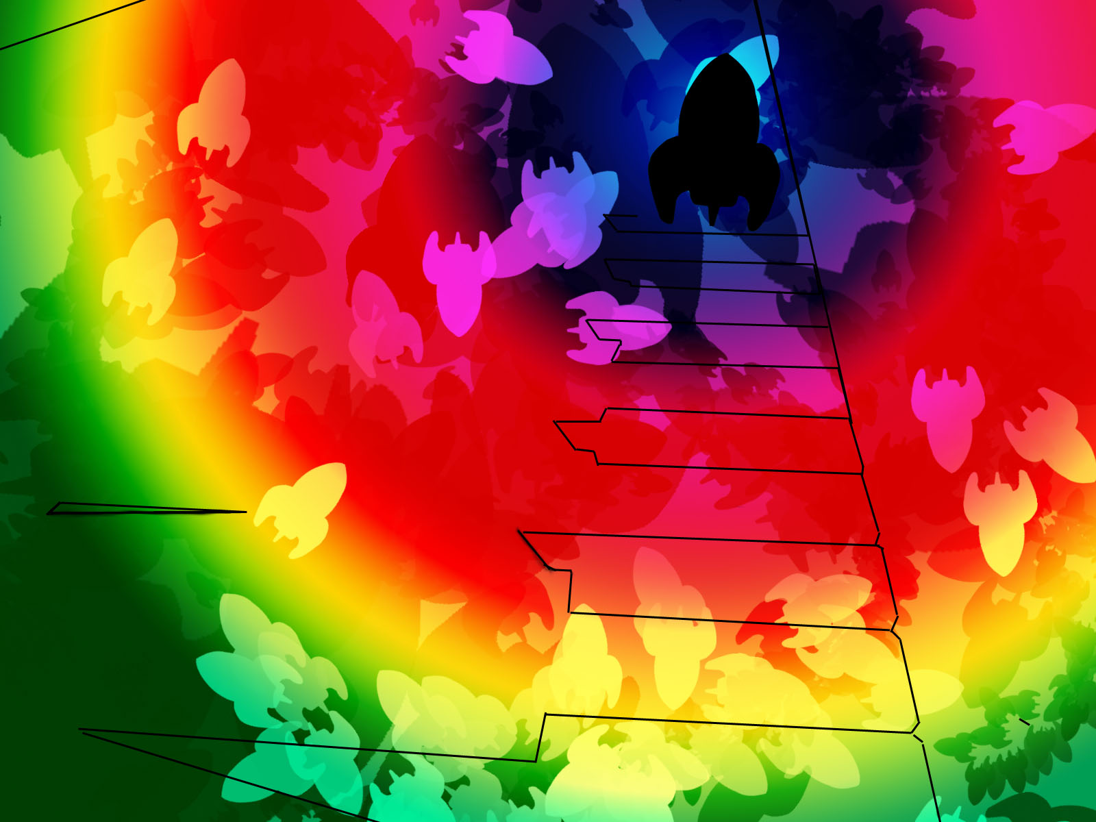
Finally, I used the Bokeh effect to edit this picture of a keyboard, then taking my logo, I made it into a brush to finish off the picture. I like it as the keys look like steps leading up to the ship, like the staircase holder in my packaging.
This background made a good design for the CD holder as its rainbow colours fit. I also like the down streak which looks like flames.
Bokeh Tutorial
Colorful background tutorial.
The idea of the box came to me as I was watching StarKid's musical 'Starship.' The biggest set piece of the play was a pair of the Starship's doors which could slide open. I tried to make the mechanism that would slide open the two doors on a box, but it was too difficult. Instead, I decided to just have two normal doors with a pair of handles to open the doors.
The Sliding doors in 'Starship'
As it was hard to close, I decided to add a padlock, inspired by the Houdini album by Jessamine:
A CD case you have to pick. My lock is a bit more traditional: you unlock it with a key.
My idea to make the unique staircase holder contained within the box came from a suggestion made by a classmate whilst listing ideas on how I could improve my packaging design. The idea came from the understanding of stages in parallel to the steps leading up to rocket-ships From that idea came this:
A three layered staircase, that is intended to contain the CD, the Inlay and a poster.
My idea of using stitching to hold the packaging together was inspired by the techniques shown in this tutorial, which was part of the summer assignment project:
The project has gone by very quickly, making it hard to finish on time, especially with the amount of work I had to hand in. I was pleased by the amount of the experiments I had done in preparation as it really helped me find a look for my packaging, unfortunately as later on I was working on the computers, I found it hard to keep my sketchbook updated as my experiment were all computer based, meaning my blog showed the most level of progress, though parts were missed out since I was working so quickly: for example when we had to do analysis on packaging ideas, I pick three random packaging ideas rather than a generalised look at them all. When I had discovered I could of looked deeply at Jessamine's 'Houdini', I was too late as I was caught in the sea of work. Since we had so much to do, there no time for mistakes, which is unfortunate as my CD packaging kept coming out frayed and unprofessional. Since I had the most to make, it took me longer to produce my work and I fell behind. I had little time to develop my ideas, improve my packaging and finish others, like my inlay and poster, so they became rushed. I do like the look of my outer packaging, though it was hard to make as it was required to be so big, meaning there was a problem printing it out. I couldn't print it all out on card, so I had to do a lot of gluing to get the pieces on. I did my best but it was still falling apart. The stitching on the staircase helped it immensely and it looked more professional. The stitching on the box helped a little as it stopped the glue from coming undone (I had to work with terrible glue) but since the width was constrained as much as possible, the staircase just manages to be put inside, and the stitching on the box became loosened slightly. The CD holder and CD are also a little frayed around the edges and a little glue is visible on the negatives but I am overall pleased about there shape. I had to make the CD at home, however I was able to print it out on a good quality card that gave it a shine. Although I had to laminate as the ink wasn't drying quickly, it still looked well-made despite a slight frayed side. I like the look of the decoration of the negatives on y CD holder as it looks innovative, though through lack of time, there isn't a track list to look at: it is only featured in the inlay. I think that if I had more time, I could of done a lot better and been sure of the way of it had all looked and fit together if I had been better at planning, as a lot of trail-and-error went into the production. Though it is satisfactory, I am slightly disappointed as it doesn't look entirely professional.
When we move on to the Personal Project, I would like to move on to developing my hand-drawn skills even more, all the while keeping in mind what I had done for the project: I have really become proficient at using Adobe Photoshop and Illustrator and would like to continue that link as well. Moving on from this, my theme will be Life, Space and the Universe, so definite links to a wide form of Nature, which I am interested in. Artists I would like to revisit and continue to explore would be Zim & Zou with their paper planets, Rob Ryan's in depth paper cutting and Deborah Moon's style and collage.
Here in this post I have my initial net plans for my CD, box, booklet and the holder which is the shape of a staircase.
In my box net design I have made no changes apart from making a small strip of card which will hold the two handles together by use of a padlock and small key.
The inside of the box will be covered, so that the tabs of the two handle will be hidden.
The "staircase" holder will be made of three compartments. The bottom shelf will hold the CD sleeve, the middle shelf will hold the booklet and the top shelf will hold the poster of the band. To make this staircase look neater, I made another net that will cover the back and the sides so that each layer wont be seen. As this part is tricky to sticky on, this gave me the idea to hold all my packaging together by sewing certain parts. I did the same on the box and I thought to develop this idea, I could sew my booklet.
When it comes around to making my final outcome, I will need to score the sides of my packaging so I don't encounter arched sides that look unprofessional.
My CD holder is also revised, so it is simple and easy to open. The CD will be held clearly in the middle and to make sure the CD wont fall out of the hole, stitched thread will cover the hole.
After working on the wallpaper and edited designs, I decided on using a few of these various styles to create a look for my packaging and artwork, trying to give these two a harmonious look. Through the wallpaper tutorials, I've decided that I like the look of the grunge wallpaper the best, as the blackened style contrasts to the rainbow colours nicely adding a space-like atmosphere. Though most of these images are mostly Photo shop created, I've still been look for ways to incorporate my handmade work, my photos and my Photo shop wallpapers.
Abstract brush experiment
Aurora wallpaper effect
Edited photo of keyboard
Grunge edition of Bokeh effect
Grunge abstract experiment
Created Smoke
Smoke made by brush tools
StarKid text design with aurora background clipping mask
Glowing rainbow design
As link StarKid to being humorous and light but with dark sides as well, I'd like to do some cartoons for the booklet as well. StarKid has always had a cartoon feel to their plays, especially in their musical: 'Holy Musical B@man!'